Instruction
Step 1. Open or create a new ad hoc view (refer to the Creating Ad Hoc Views article for further information) Step 2. Click on the Select Visualisation Type icon in the top menu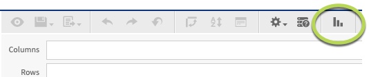
- Heat Map
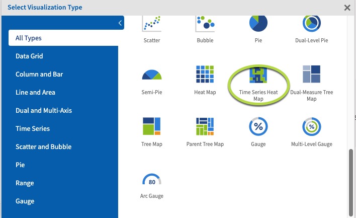
- Time Series Heat Map
- Dual-Measure Tree Map
- Tree Map
- Parent Tree Map
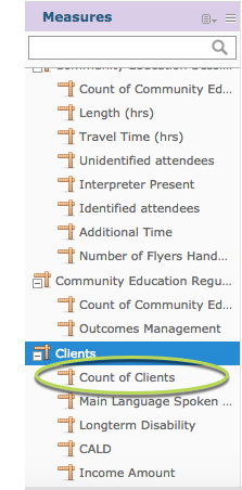
 Step 5. Click and drag a measure from the measures area on the left-hand side pane to the column area.
e.g. Count of Clients
Step 5. Click and drag a measure from the measures area on the left-hand side pane to the column area.
e.g. Count of Clients
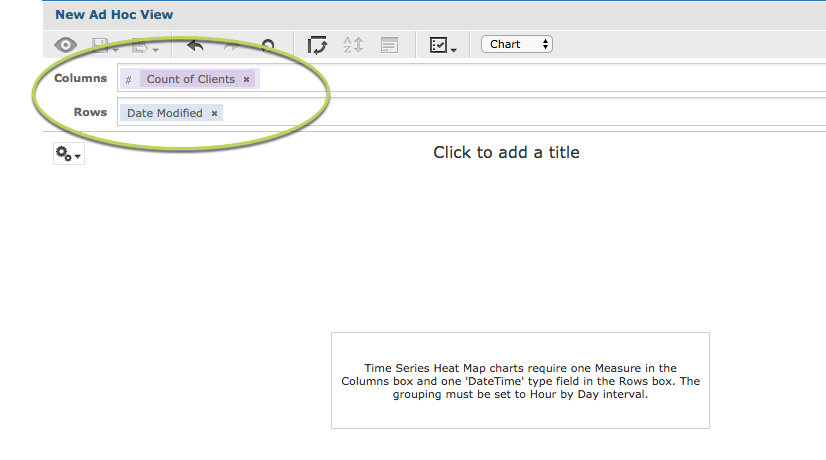
Tip: All charts must have at least one measure.
Time Series Heat Maps require one measure in the columns area and one datetime type field in the rows area.
Step 6. Click and drag a date time field to the rows area. e.g. Date modified
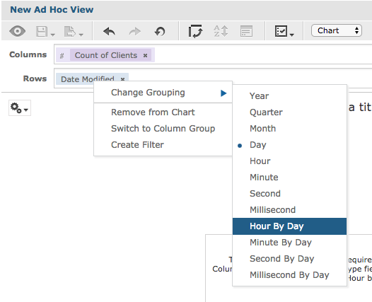
 As the chart requires the date time field to be grouped ‘Hour by Day’ you will need to adjust the grouping for the information to appear.
Step 7. Right click on the Date Modified field label.
Click on Change Grouping.
Select Hour By Day.
As the chart requires the date time field to be grouped ‘Hour by Day’ you will need to adjust the grouping for the information to appear.
Step 7. Right click on the Date Modified field label.
Click on Change Grouping.
Select Hour By Day.
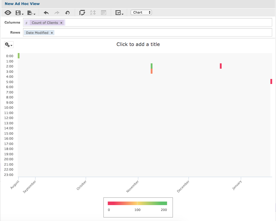
 The chart is displayed