Instruction
Step 1. Open or create a new ad hoc view (refer to the Creating Ad Hoc Views article for further information) Step 2. Click on the Select Visualisation Type icon in the top menu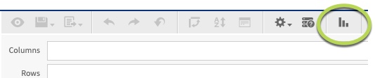
- Heat Map
- Time Series Heat Map
- Dual-Measure Tree Map
- Tree Map
- Parent Tree Map
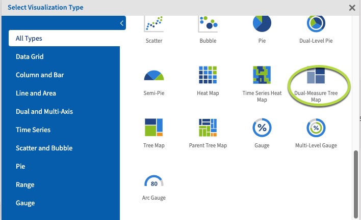 The Dual-Measure tree map chart displays data as colour coded rectangles. The size of the rectangle is proportional to the first measure and the colour represents the second measure.
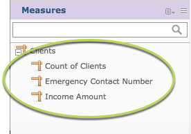
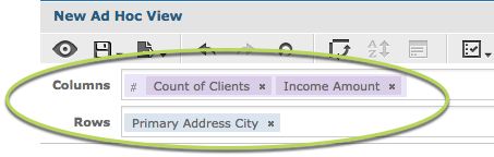
Step 5. Click and drag 2 measures from the measures area on the left hand side pane to the column area.
e.g. Count of Clients, Income Amount
The Dual-Measure tree map chart displays data as colour coded rectangles. The size of the rectangle is proportional to the first measure and the colour represents the second measure.
Step 5. Click and drag 2 measures from the measures area on the left hand side pane to the column area.
e.g. Count of Clients, Income Amount
Tip: All charts must have at least one measure.

Dual-Measure Tree map charts require 2 measures in the columns area and one field in the rows area.
Step 6. Click and Drag a field to the columns area e.g. Primary Address City.
 This allows the measure data to be broken up by the field information.
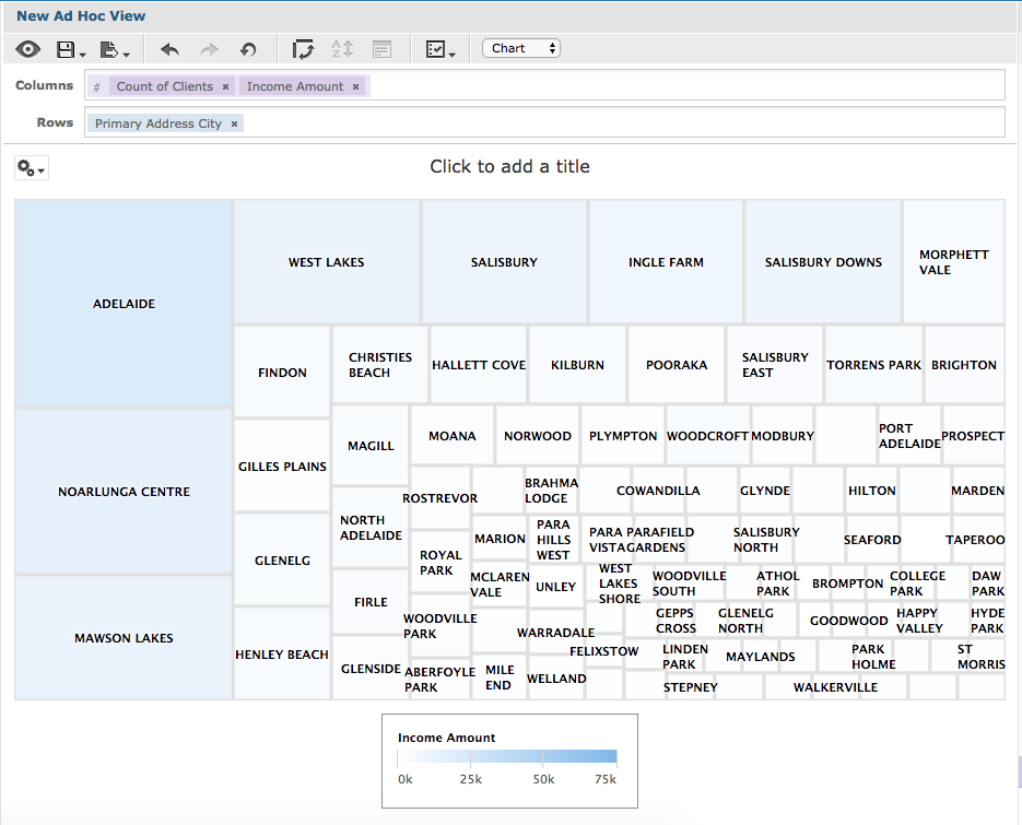 The measures are displayed against the selected field.
The Size of the rectangle indicates the first measure (count of clients) and the colour represents the 2nd measure (income amount).
The measures are displayed against the selected field.
The Size of the rectangle indicates the first measure (count of clients) and the colour represents the 2nd measure (income amount).