Charts are useful tools for graphically displaying information.
Sometimes, you may wish to change the format of your charts, beyond the basic options.
There are many options available within the Chart Format tool.
Instructions
Step 1. Open or create a new ad hoc view (refer to the Creating Ad Hoc Views article for further information)
Step 2. Click on the Select Visualisation Type icon in the top menu

The Select Visualisation Type window is displayed
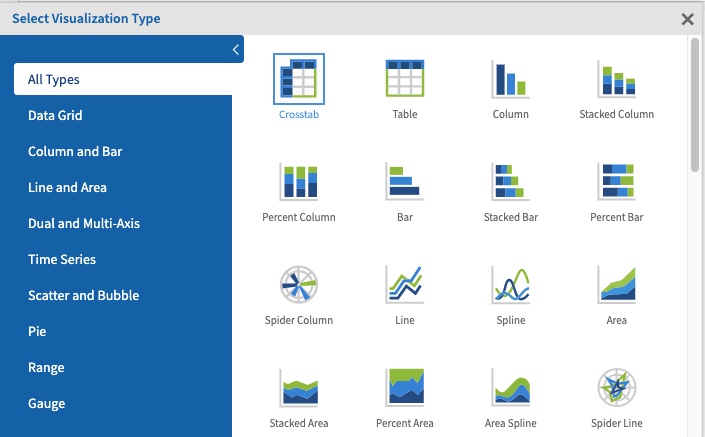
Step 3. Select the required chart type from the list.
You can select a category on the left to narrow down the list.
Step 4. Select the required chart
Step 5. Add the required fields and measures to your chart.
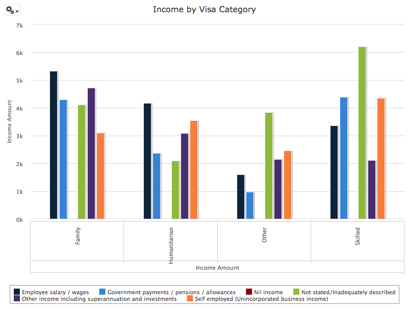
Step 6. To change the chart format, click the options dropdown again.
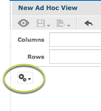
Step 7. Select Chart Format
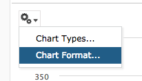
The Axis tab is displayed
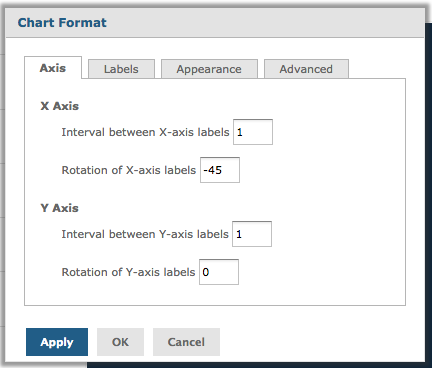
For information on formatting using the Axis tab, refer to the Ad Hoc View – Chart Format – Axis article.
Step 8. Click on the Appearance tab
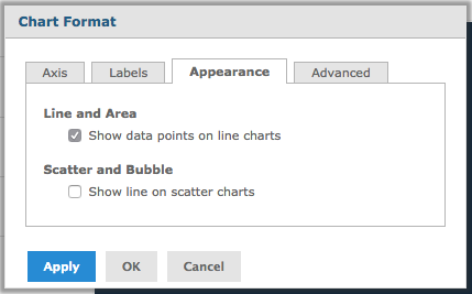
Click the checkbox for one of the fields (see below).
Tip - Appearance options only work on the specified chart
types e.g. Line, Area, Scatter and Bubble.
Click Apply for the changes to appear on your chart.
Click OK to save the changes and exit.
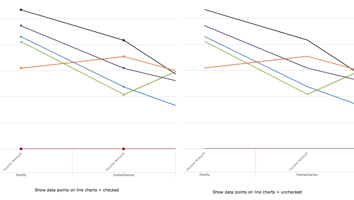
Line and Area Options:
- Show data points on line charts
- Check the box to display points on a line chart
- Uncheck the box to not display points on a line chart
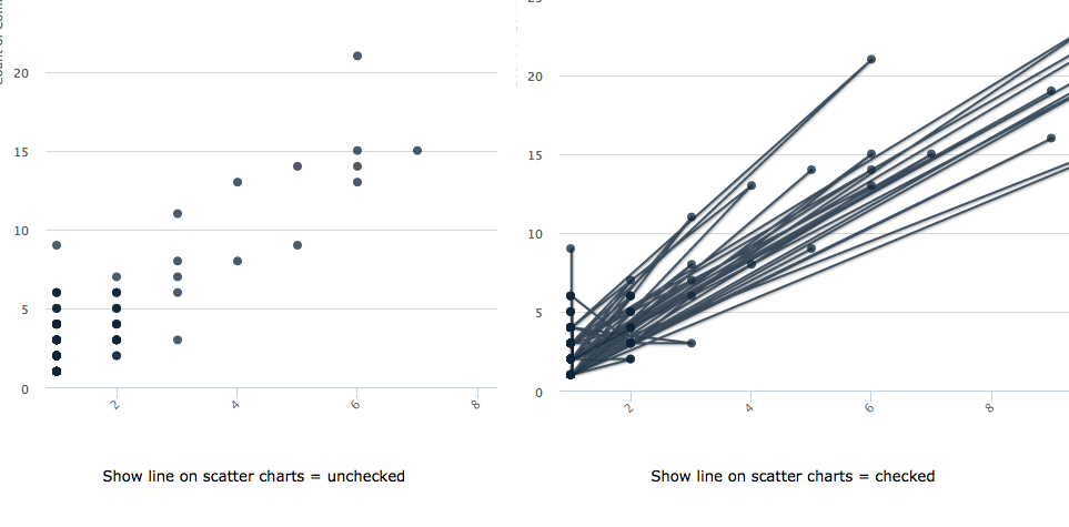
Scatter and Bubble Options:
- Show line on scatter charts
- Check the box to show lines between points on scatter charts
- Uncheck the box to not show lines between points on scatter charts
Further information
For more information on working with chart formats, refer to the following articles:
