We are upgrading our Community BI Server in April 2020. Most of the functionality will remain the same, with some additions, some fixes and a new look and feel.
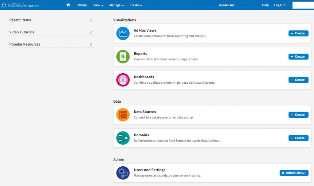
The Community BI home page looks different.
All the items you had access to before are still there, they just look a little different.
The layout has changed and there are new icons and colour coding for Ad Hoc Views, Reports and Dashboards.
The Ad Hoc View Editor looks a little different too.
The Fields, Measures and Filters are in the same place, but they have new icons and colours.
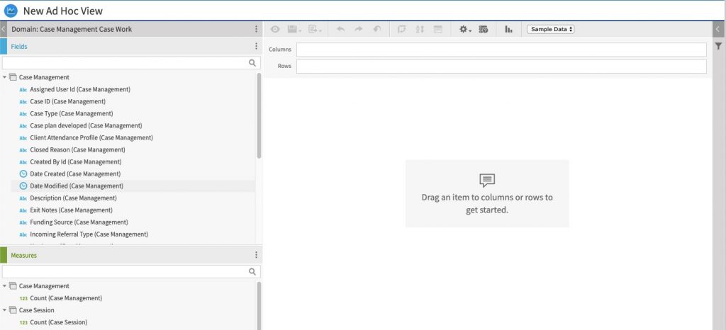
If you look closely at the Fields and Measures icons you will see that they tell you whether the field is Alphanumeric, Numeric, Date, or Time based.
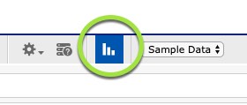
Creating charts has changed.
You still create an ad hoc view as you did before, but instead of selecting Crosstab, Chart, or Table from a dropdown box in the menu bar, you click on an icon to select your Visualisation Type.
You can still select Crosstab or Table, but you also have the option to select your Chart type in the same location.
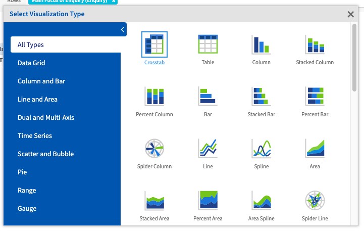
New Charts!
There are some new charts available.
- Gauge
- Multi-Level Gauge
- Arc Gauge

If you have any concerns, please contact support on support@communityds.com.au