Ad Hoc Views allow you to visualise and analyse the data you capture for your organisation.
Ad Hoc Views can be viewed in the Community BI system or in reports and dashboard.
Information
With so many options to choose from it can be difficult to select the best view for your data.
It is important to think about what information you need to access and what messaged you need to convey.
There are three categories of Ad Hoc Views available in Community BI.
- Tables allow you to view a simple representation of data fields and measures.
- Crosstabs have different data, layout and format options than tables or charts. Crosstabs are similar to Pivot Tables that you may have used in other systems.
- Charts allow you to graphically display your data. There are a number of different chart types available, including Column, Bar, Pie and Spider.
Tables
If you just want a quick list of all clients for a particular location you might use a table.
Table Example:
Client ID, Client Status and Client Gender grouped by Country of Birth
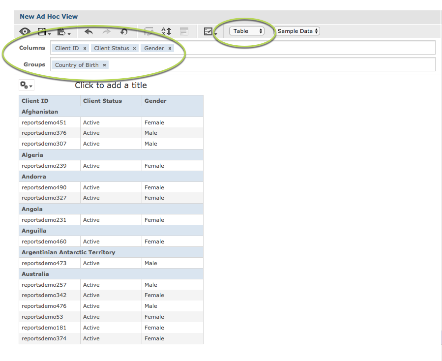
For more information on creating a Table Ad Hoc View refer to the following article: Ad Hoc View – Table
Crosstabs
If you want to easily see totals for particular groups, you may wish to use a crosstab view.
Crosstab Example:
Starting with the same information as for the table view above, the Crosstab view uses Client ID as a measure to count the number of clients for each group. – Total, female and male numbers for each country of birth.
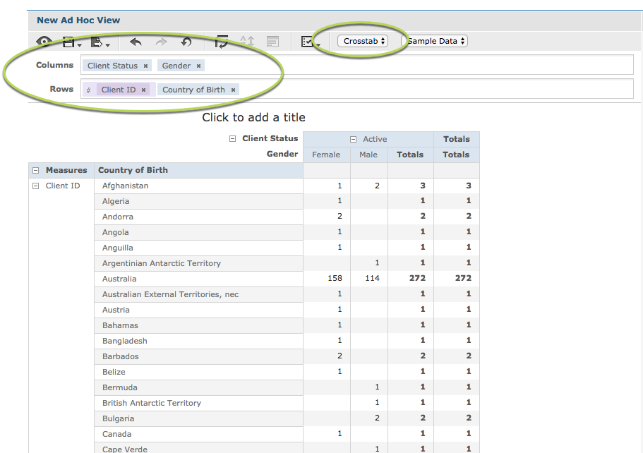
The Crosstab shows individual measures as well as sub-totals and grand totals.
The Crosstab columns and rows can be expanded or collapsed easily to highlight different levels of information.
For more information on creating a Crosstab Ad Hoc View, refer to the following article: Ad Hoc View – Crosstab
Charts
Charts are best for visual representations of data. They make it easy to see patterns or differences between groups. Charts are generally more effective as a summary of group data, rather than information on individuals.
Chart Example:
The stacked column chart below shows total income amount for all clients for a Primary Address City. The columns are cut into the various Main Source of income options. Note that a filter has been applied to make the chart easier to view.
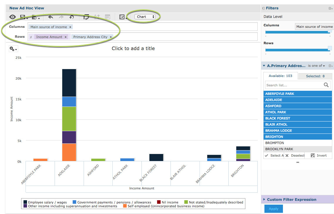
There are many different charts available, ranging from simple bar or pie charts to complex multi-axis charts.
Further Information
- For further information on Ad Hoc Views, refer to the Ad Hoc Views category.
- For information on which chart to select, refer to the Which Chart should I use article.
- For further information on Charts, refer to the Ad Hoc Views – Charts category.