Instructions
Step 1. Open or create a new ad hoc view (refer to the Creating Ad Hoc Views article for further information) Step 2. Click on the Select Visualisation Type icon in the top menu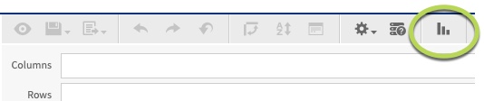
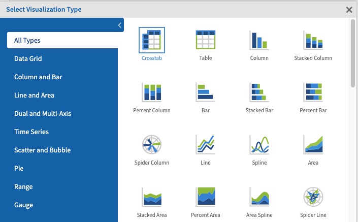
- Column Line
- Column Spline
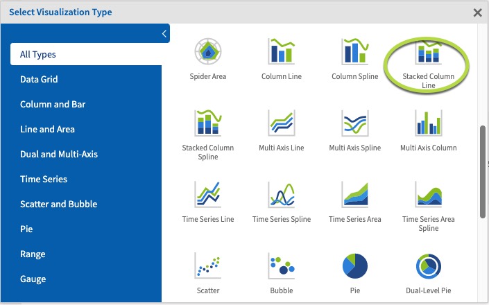
- Stacked Column Line
- Stacked Column Spline
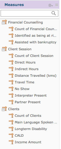
 Step 5. Click and drag 3 measures from the measures area on the left hand side pane to a row.
Tip: for the data to be meaningful, the measures should be on the same scale, e.g. hours, $, count of attendances, number of clients.
 e.g. Direct Hours, Indirect Hours, Travel Time (this will indicate the total time invested in sessions as a stacked column), Count of Financial Counselling (this will show the number of sessions)
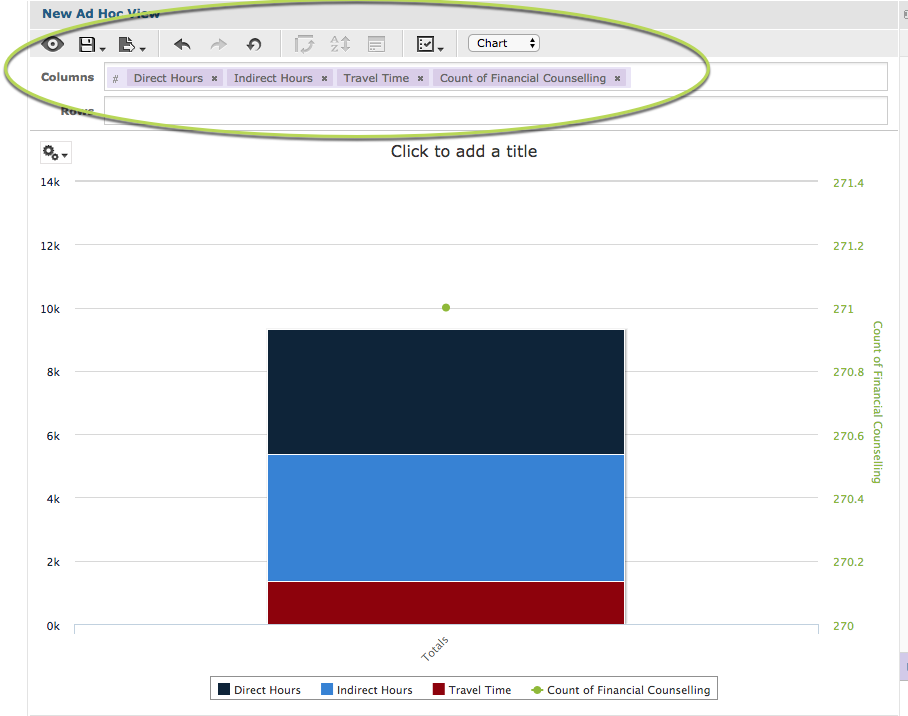 With 4 measures and no fields, the chart displays the stacked column for the first (left-most) measures and a point for the last (right) measure.
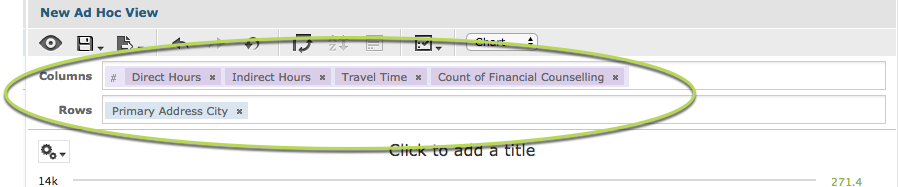
Step 6. Click and Drag a field to the rows area
e.g. Primary Address City.
This allows the measure data to be broken up by the field information.
With 4 measures and no fields, the chart displays the stacked column for the first (left-most) measures and a point for the last (right) measure.
Step 6. Click and Drag a field to the rows area
e.g. Primary Address City.
This allows the measure data to be broken up by the field information.
 You’ll notice when the field is added that the chart may not change.
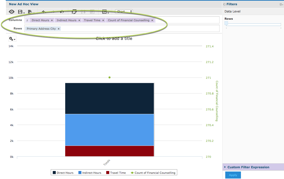 In the right hand side pane there is a section caller Data Level.
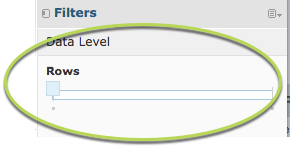 The slider allows you to quickly change the level at which the data is reported. When the slider is all the way to the left, it shows the measure total.
Step 7. Slide the slider all the way to the right.
The slider allows you to quickly change the level at which the data is reported. When the slider is all the way to the left, it shows the measure total.
Step 7. Slide the slider all the way to the right.
Tip: If you hover your mouse over the left and right ends of the slider the data level options will be displayed. Sometimes there are multiple options along the length of the slider.
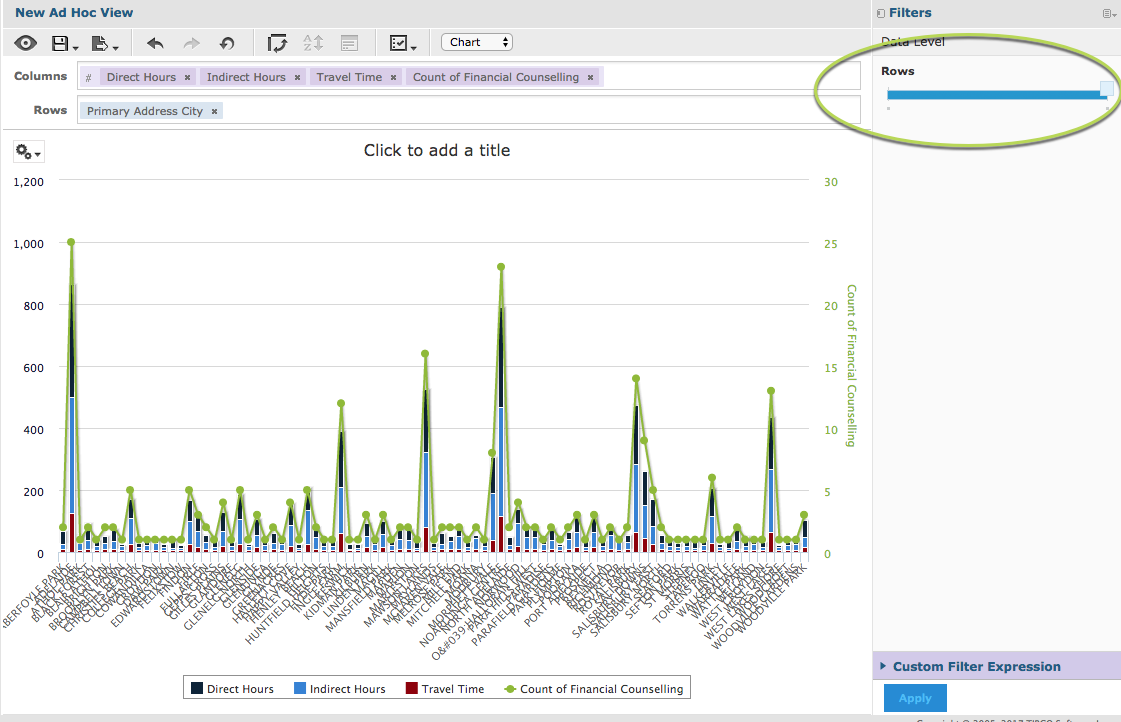 The measure is now broken up by the added field.
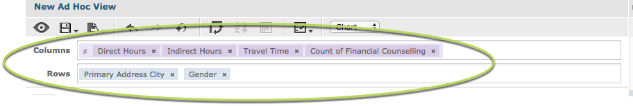
Step 7. To break the measure further, add another field to the rows section.
e.g. Gender
The measure is now broken up by the added field.
Step 7. To break the measure further, add another field to the rows section.
e.g. Gender
 Again, the chart does not change as the slider begins at the totals (far left) end.
Step 8. Slide the rows slider to the right.
Again, the chart does not change as the slider begins at the totals (far left) end.
Step 8. Slide the rows slider to the right.
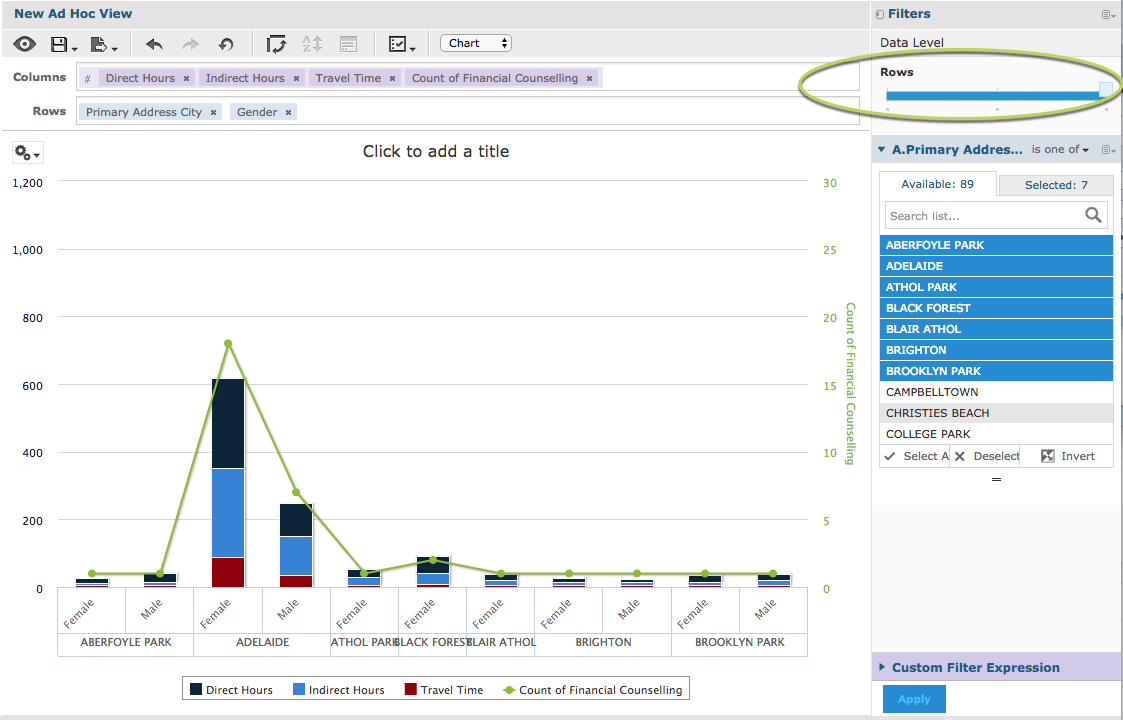 Note – to make the chart clearer, we have added a filter to only show a subset of data. For more information on Filters, refer to Ad Hoc View – Filters
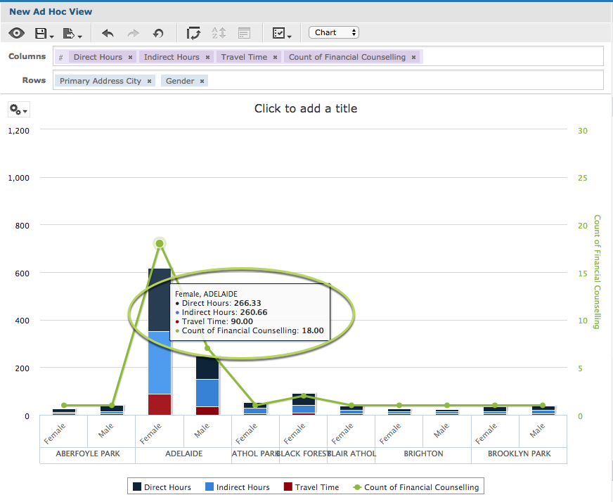
The measures are now split by the additional row field (Gender) but grouped by the row field (Primary address city).
If you change the order of these rows, the chart will group by Gender and split by primary address city.
If you add additional fields to the rows or columns, the sliders will update and the measures will be split if you move the sliders.
You may find that the chart becomes less useful if you add too many fields.
Step 9. Hover your mouse over a data point to display the detail of the measures.
Note – to make the chart clearer, we have added a filter to only show a subset of data. For more information on Filters, refer to Ad Hoc View – Filters
The measures are now split by the additional row field (Gender) but grouped by the row field (Primary address city).
If you change the order of these rows, the chart will group by Gender and split by primary address city.
If you add additional fields to the rows or columns, the sliders will update and the measures will be split if you move the sliders.
You may find that the chart becomes less useful if you add too many fields.
Step 9. Hover your mouse over a data point to display the detail of the measures.