Area Charts display data points connected with a straight line and a color below the line; groups are displayed as transparent overlays.
Area charts compare values displayed as points connected by lines, with colour below the line.
Charts allow you to graphically display your data. There are a number of different chart types available.
Instructions
Step 1. Open or create a new ad hoc view (refer to Creating Ad Hoc Views for further information)
Step 2. Select Chart from the drop down at the top of the screen.
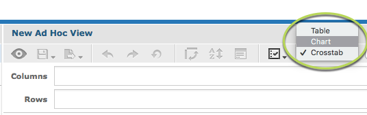
By default, a column chart is selected.
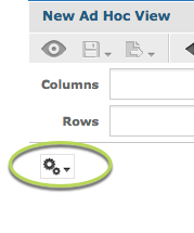
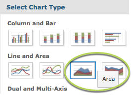
Step 3. To change the chart type, click the options drop down in the top left corner of the chart area.
Area Charts
Area charts display data points connected with straight lines, with colour below the line.
There are four Area charts available:
Each chart type displays your data in slightly different ways.
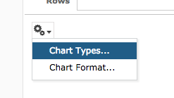
Step 4. Select Chart Types and select Area chart.
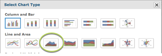
Hover your mouse over the chart thumbnail to see the chart type name.
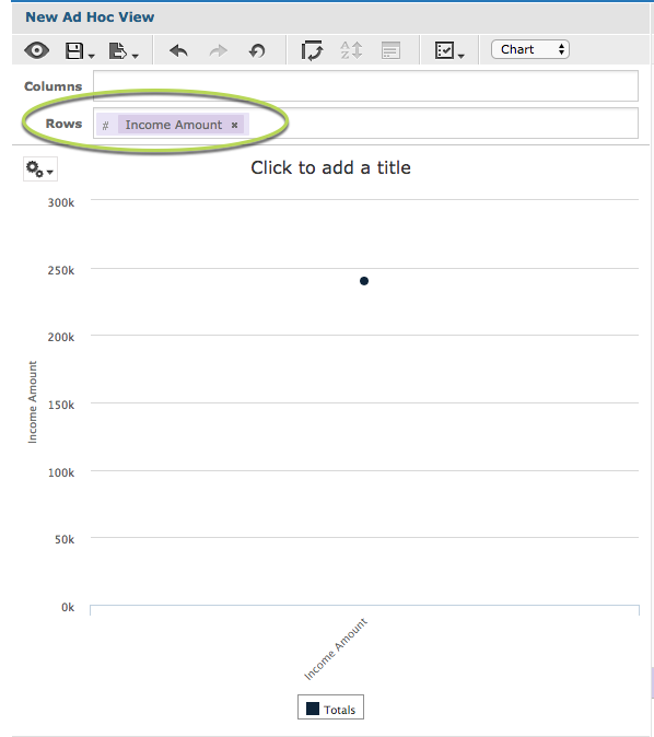
Step 5. Click and drag a measure from the measures area on the left hand side pane to a row or column.
e.g. Income Amount
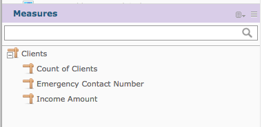
Tip: All charts must have at least one measure.
With a single measure and no fields, the chart displays the total for the measure.
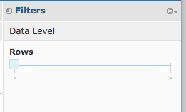
Step 6. Click and Drag a field to the rows area
e.g. Primary Address City.
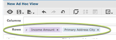
This allows the measure data to be broken up by the field information.
You’ll notice when the field is added that the chart may not change.
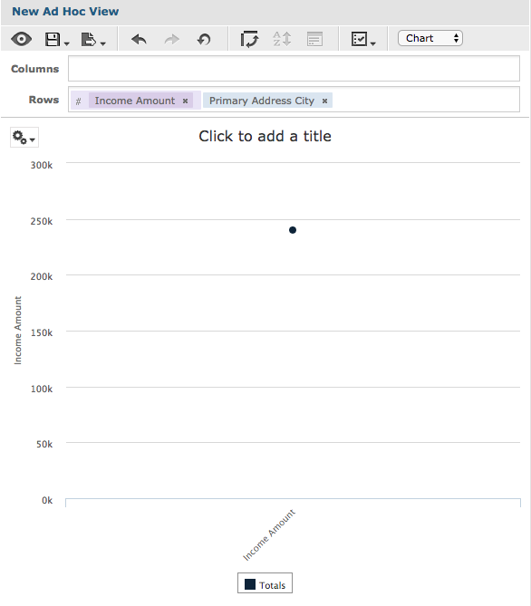
In the right-hand side pane, there is a section caller Data Level.
The slider allows you to quickly change the level at which the data is reported. When the slider is all the way to the left, it shows the measure total.
Step 7. Slide the slider all the way to the right.
Tip: If you hover your mouse over the left and right ends of the slider the data level options will be displayed. Sometimes there are multiple options along the length of the slider.
The measure is now broken up by the added field.
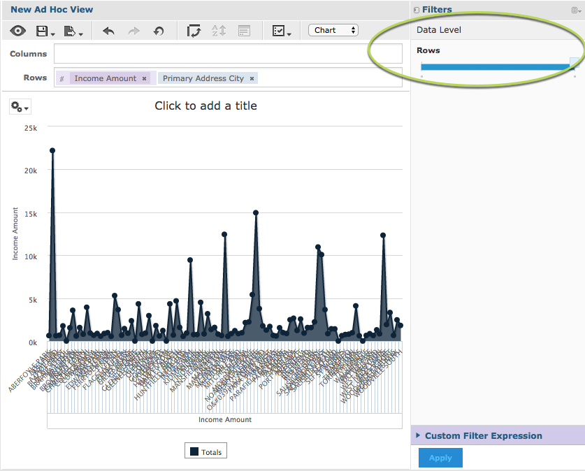
Step 7. To break the measure further, all a field to the columns section.
e.g. Gender
Again, the chart does not change as the slider begins at the totals (far left) end.
Step 8. Slide the columns slider to the right.
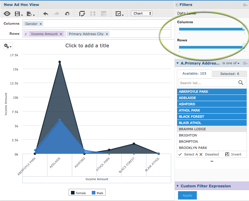
Note – to make the chart clearer, we have added a filter to only show a subset of data. For more information on Filters, refer to Ad Hoc View – Filters
The measures are now split by the additional column field (Gender) but grouped by the row field (Primary address city).
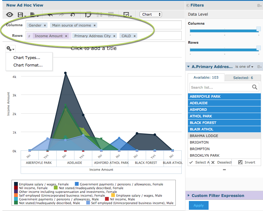
If you add additional fields to the rows or columns, the sliders will update and the measures will be split if you move the sliders.
You may find that the chart becomes less useful if you add too many fields.
Further Information
For further information on Ad Hoc Views and Charts, refer to the following articles: