Time Series Area charts display date and time data points connected with a straight line and a colour below the line; groups are displayed as transparent overlays.
Time Series Area charts display date and time data points connected with a straight line and a colour below the line; groups are displayed as transparent overlays.
Charts allow you to graphically display your data. There are a number of different chart types available.
Time Series charts display values at successive time intervals.
Instructions
Step 1. Open or create a new ad hoc view (refer to the Creating Ad Hoc Views article for further information)
Step 2. Click on the Select Visualisation Type icon in the top menu
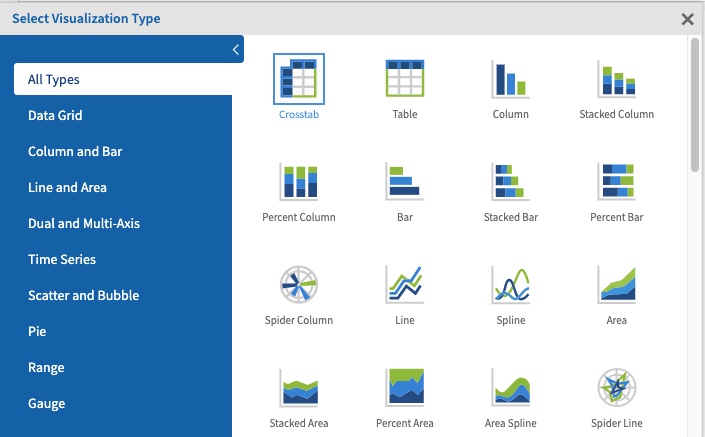
The Select Visualisation Type window is displayed
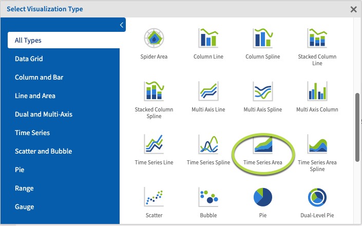
Step 3. Select Time Series from the Chart Types list
There are 4 Time Series charts available:
- Time Series Line
- Time Series Spline
- Time Series Area
- Time Series Area Spline
Each chart type displays your data in slightly different ways.
Step 4. Click on Time Series Area
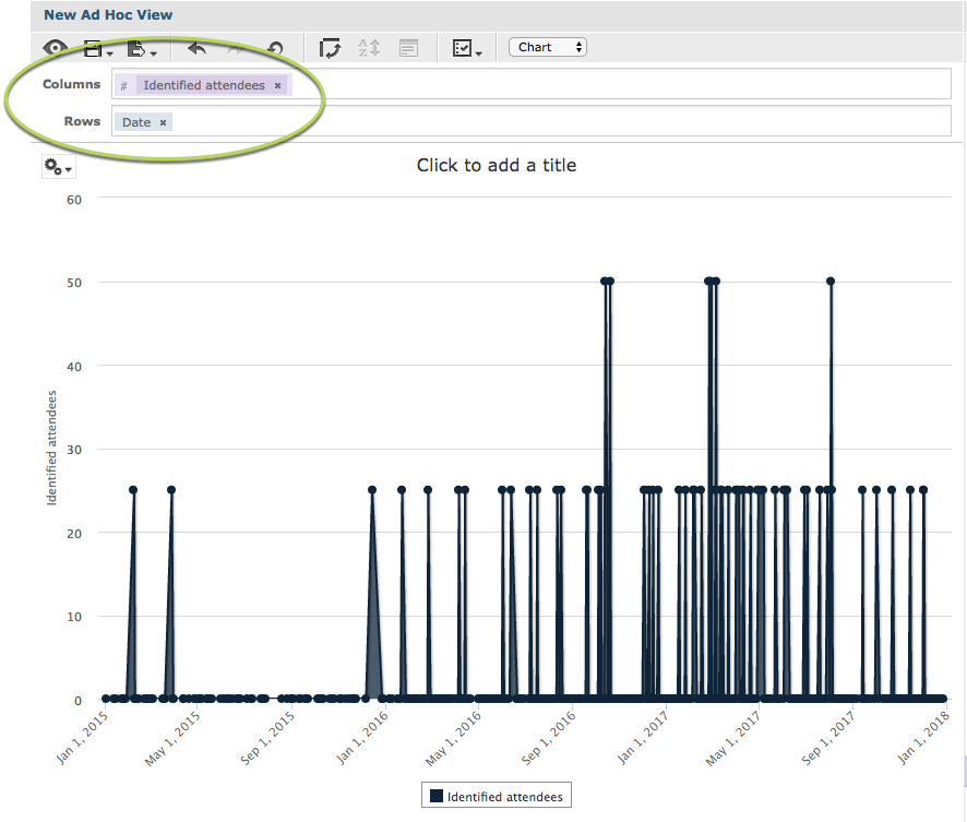
Step 5. Click and drag a measure from the measures area on the left hand side pane to a column.
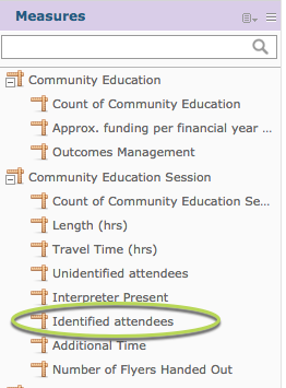
e.g. Identified Attendees
Tip: All charts must have at least one measure, Time Series charts must also have a date field.
Step 6. Click and Drag a date field from the Fields area on the left hand side to the Rows area.
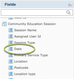
e.g. Date (Community Education Session)
The measure results are displayed over the selected dates.
Step 7. To break the measure further, add a field to the columns section.
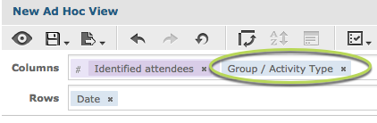
e.g. Group/Activity Name
You’ll notice when the field is added that the chart may not change.
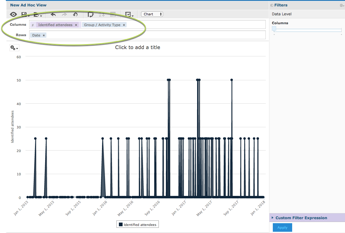
In the right hand side pane there is a section caller Data Level.
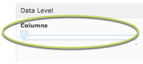
The slider allows you to quickly change the level at which the data is reported. When the slider is all the way to the left, it shows the measure total.
Step 8. Slide the columns slider to the right.
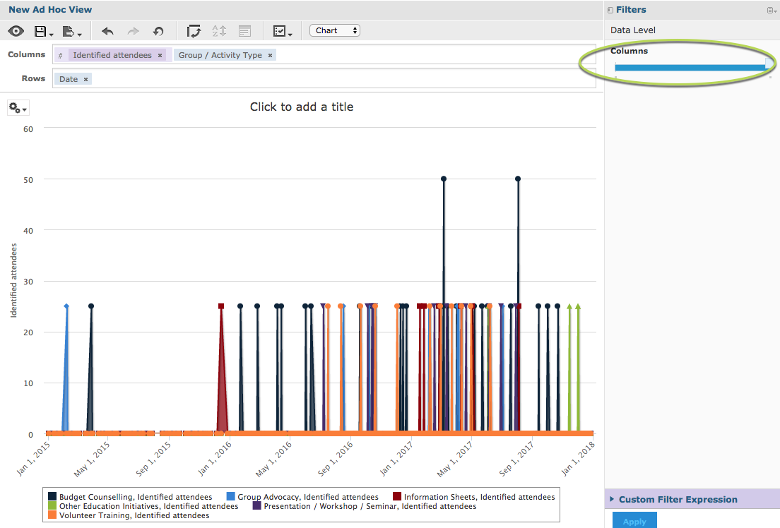
The measures are now split by the additional column field (Group Activity Name) but grouped by the row field (Date).
If you add additional fields to the rows or columns, the sliders will update and the measures will be split if you move the sliders.
You may find that the chart becomes less useful if you add too many fields.
Further Information
For further information on Ad Hoc Views and Charts, refer to the following articles: